How data visualization is raising awareness about the pain of sexual harassment
Ontario Tech University researcher leading project that applies technology to illuminate too-often under-reported issue
March 11, 2021
If a picture paints a thousand words, does a composite image using data-visualization technology potentially say even more?
It’s a scientific and social question being explored through powerful research led by Ontario Tech University researcher Dr. Christopher Collins. The university’s Canada Research Chair in Linguistic Information Visualization is examining how the issue of sexual harassment can achieve greater visibility by using data visualization as a communicative medium.
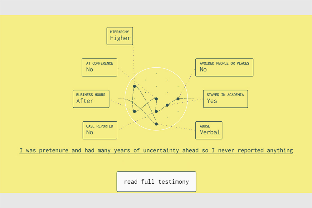
Specifically, Dr. Collins is documenting the sexual harassment experiences reported by people in academia around the world.
“With my international collaborators Dr. Karen Kelsky in the United States and Dr. Uta Hinrichs at the University of St Andrews in Scotland, we input publicly available data* of more than 2,000 personal stories collected through an anonymous survey documenting experiences and their impacts,” says Dr. Collins, Associate Professor with Ontario Tech’s Faculty of Science. “My research group at Ontario Tech manually processed the data to create a living and growing visualization and art piece. We want to raise awareness for this issue.”
The public can explore the visualization on the website Tied in Knots. The system design focuses on the metaphor of a ‘knot’, where each knot in the graphic represents a unique story. Knot is also a homonym of ‘not’.
The knot metaphor was the result of many hours of design iterations between Dr. Adam Bradley, a research scientist in Dr. Collins’ lab, and the lead designer, Tommaso Elli, a PhD student visiting Ontario Tech from Politecnico di Milano in Italy.
“Perhaps not surprisingly, the word ‘not’ also appears a lot in the stories, documenting such sentiments such as ‘the university did not do anything’ or ‘he would not stop’,” says Dr. Bradley. “We also had to be cognizant and careful about the impact of working on this data on the team ourselves, as the comments are quite upsetting and disturbing.” The visuals are accompanied by audio recordings contributed by volunteers. The multimedia experience adds a layer of emotional impact to the stories.
All of the data in the visualization is anonymous. Ontario Tech is not named in any of the stories.
The researchers presented the completed visualization internationally at the Fall 2020 Institute of Electrical and Electronics Engineers (IEEE) VIS Conference in the Arts Program track.
“While the visualization summarizes collective data, it’s important to stress this project also honours the individual stories,” says Dr. Collins. “Where my typical work summarizes data and shows aggregates and patterns, here we show each story objectively. That, I think, is the novelty and power of this research.”
Background information
*Data collected from a 2017 original post (A Crowdsourced Survey of Sexual Harassment in the Academy) by U.S. researcher Dr. Karen Kelsky, a former tenured professor of anthropology and a member of the design team of this project. The data does contain stories that reveal institution names, but not individuals.
1 > 1Gallery
Media contact
Bryan Oliver
Communications and Marketing
Ontario Tech University
289.928.3653
bryan.oliver@ontariotechu.ca
More news
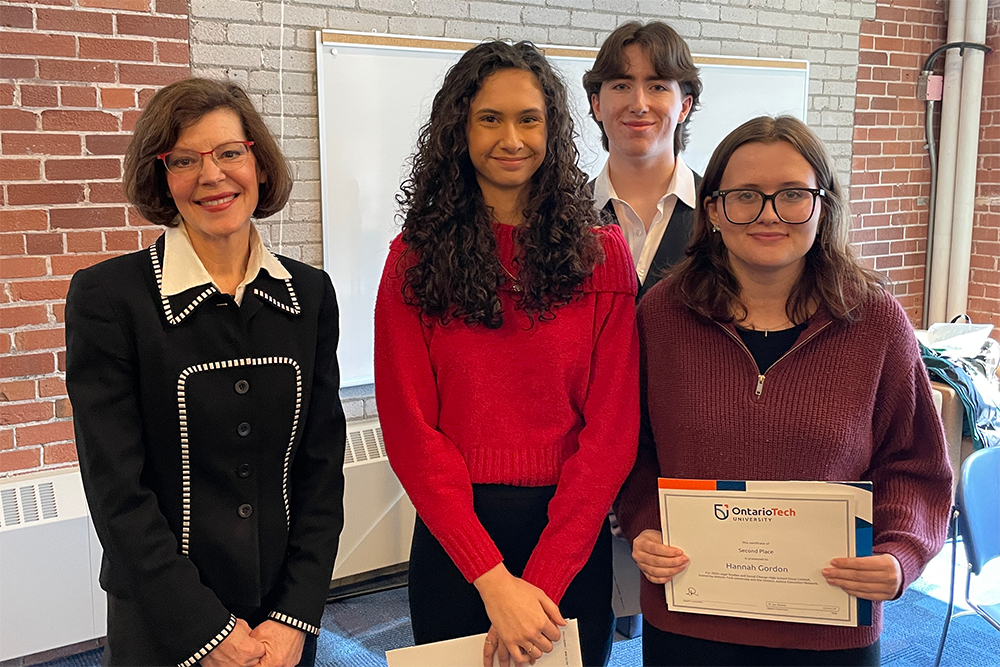
Ontario Tech recognizes top high school students in second annual essay contest

Ontario Tech researcher exploring how AI can help keep connected technologies secure
From the dinner table to the national stage: Salma Bafagih on research, resilience and food literacy
HackHive brings students together to build practical AI solutions
Ready for tomorrow’s careers.
We prepare our students for the fast-paced, ever-evolving world of technology.